The Conversion Cocktail: Mixing the Perfect Recipe for Website Success
Let’s face it – in today’s digital world, having a well-designed website is crucial for the success of your business. It’s your online storefront, and you want it to be as welcoming and user-friendly as possible. But let’s be honest, it’s not just about looking pretty. Your website’s design can have a massive impact on your conversion rates and the overall user experience. The good news is we’re here to share 10 essential design tips that will help you stop losing customers and start driving higher conversions. So, sit back, grab your favorite beverage, and let’s dive into creating a website that not only looks great but also delivers fantastic results for your business.
Tip 1: Mobile-First Design
Welcome to the era of smartphones and tablets! Mobile internet usage has skyrocketed in recent years, and it’s showing no signs of slowing down. This means your website must cater to users on various devices and screen sizes. So, how do you do that? By adopting a mobile-first design approach.
A mobile-first design means you create your website with mobile devices in mind from the start. This ensures a seamless user experience across all devices, including desktops, laptops, tablets, and smartphones. To achieve this, you’ll want to implement a responsive design that automatically adapts to the user’s screen size.
When your website looks great and functions smoothly on mobile devices, you’ll not only provide a better user experience but also increase the chances of converting visitors into customers. Trust us – your mobile users will thank you!
Tip 2: Simple and Intuitive Navigation
Imagine walking into a store with items scattered everywhere and no clear organization. You’d probably walk right back out, right? The same principle applies to your website. A confusing and poorly organized website is a surefire way to lose customers. That’s why it’s essential to create simple and intuitive navigation for your website.
First, ensure your main menu is clearly visible and easy to understand. Use clear labels that accurately represent the content on each page. Avoid using jargon or overly creative titles that might confuse your visitors. You will also want to have an organized page structure on your main menu based on heirarchy. Including all of your services in the main navigation will look cluttered, overwhelming and will not respond well to different desktop sizes. Consider creating categories or drop down menus.
For larger websites, consider implementing a search feature that allows users to find the information they need quickly. This can be a lifesaver for users who are short on time or have a specific query in mind. Also, consider creating a mega menu. It’s a great way to include more than 4-6 items in your navigation while keeping the structure organized and easy to understand.
By providing a user-friendly navigation experience, you’ll make it easier for your visitors to explore your website, find what they’re looking for, and ultimately, convert into customers. So keep it simple, keep it organized, and watch those conversions soar!


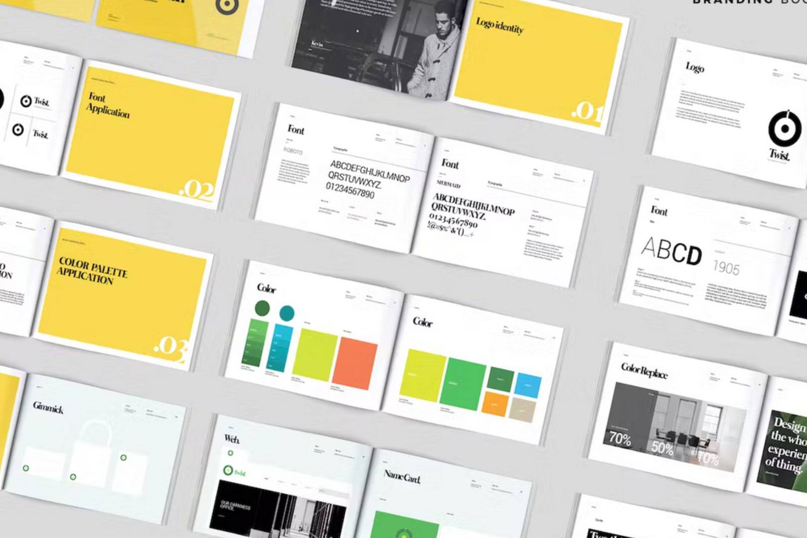
Tip 3: Consistent Branding and Visual Identity
Your website is an extension of your brand, and it should reflect your unique visual identity. Consistent branding throughout your website not only creates a cohesive and professional appearance but also helps build trust and recognition with your visitors. To achieve this, ensure that your website’s design elements align with your brand’s colors, fonts, and overall style.
Start by establishing a consistent color palette that matches your logo and marketing materials. Use these colors strategically throughout your website, in elements like headers, buttons, and backgrounds. Next, choose one or two complementary fonts that reflect your brand’s personality and are easy to read. Apply these fonts consistently across all your website’s text elements.
Don’t forget about other design elements, such as icons, images, and graphics, which should also be in line with your brand’s visual identity. Creating a Brand Guide will help maintain a uniform look and feel across all platforms. By maintaining consistent branding and visual identity across your website, you’ll create a memorable experience for your visitors, making them more likely to convert into customers.
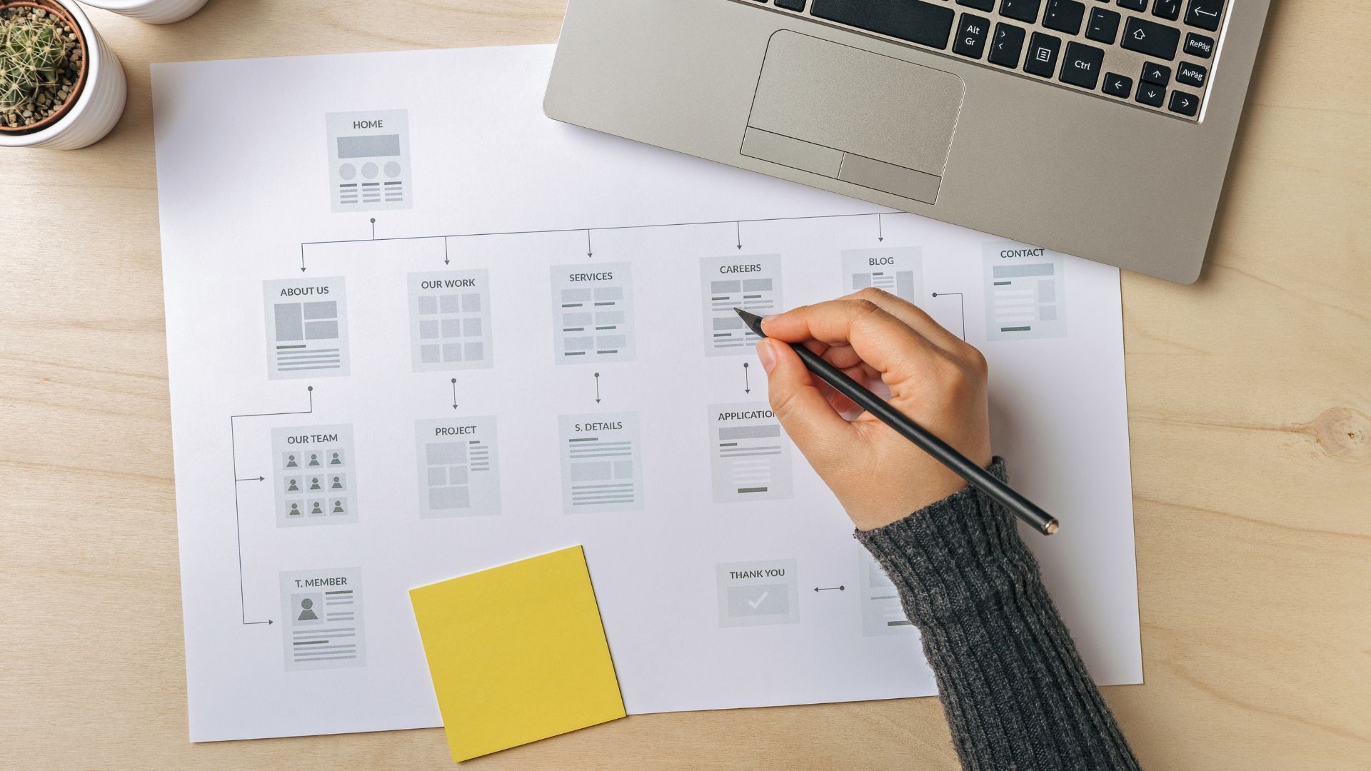
Tip 4: Create a Comprehensive Sitemap for Content Creation
Before diving headfirst into creating content for your website, it’s crucial to have a clear and organized plan in place. A sitemap serves as a visual representation of your website’s structure, outlining the hierarchy of your pages and how they connect. Not only does a sitemap help search engines crawl and index your website more efficiently, but it also provides a solid foundation for generating relevant and engaging content.
To create a sitemap, begin by listing all the primary pages of your website, such as your homepage, product pages, and contact page. Then, consider the secondary pages that support your primary pages, such as blog categories, FAQs, or case studies. Organize these pages in a hierarchical manner, grouping related pages together.
Once you’ve established a clear structure for your website, you can use the sitemap to guide your content generation efforts. Identify gaps in your existing content and brainstorm new topics or pages that would add value for your visitors. This systematic approach will ensure your content is well-organized, comprehensive, and easy for both users and search engines to navigate.
With your sitemap in place, you’ll be better equipped to create targeted, relevant content that engages your visitors and encourages them to explore your website further, ultimately leading to higher conversion rates.
Tip 5: Fast Page Load Speed
Have you ever rage-closed a browser because the website took too long to load? Yeah, you’re not alone. We live in a fast-paced world, and people are used to getting information in the blink of an eye. When a website takes too long to load, it can be incredibly frustrating for users, and you can bet they won’t stick around for long. In fact, studies have shown that even a one-second delay in page load time can lead to a significant drop in conversions. That’s why it’s crucial to ensure your website loads quickly.
To improve your website’s page load speed, start by optimizing your images. Large, high-resolution images can take a long time to load, so consider compressing them or using more web-friendly formats like JPEG or WebP. Additionally, minimize the amount of code on your website by removing unnecessary spaces, comments, or unused code. This can help reduce the time it takes for your site to load.
Other ways to speed up your website include enabling browser caching, using a content delivery network (CDN), and minimizing the number of plugins or scripts running on your site. By investing in a faster-loading website, you’ll provide a better user experience and increase your chances of converting visitors into customers. Remember, every second counts!
Tip 6: Compelling Call-To-Action
So, you’ve got visitors browsing your website, enjoying the smooth navigation and lightning-fast load times. Now, it’s time to seal the deal and convert them into customers. This is where Call-to-Action (CTA) buttons come into play. CTAs are crucial for guiding your visitors to take the desired action, whether it’s making a purchase, signing up for a newsletter, or contacting you for more information.
To create effective CTAs, start by designing buttons that stand out and grab your visitors’ attention. Use contrasting colors and bold fonts to ensure your CTAs don’t get lost in the background. Keep the text on your buttons clear, concise, and action-oriented. Phrases like “Buy Now,” “Sign Up,” or “Get Started” work well.
Next, strategically place your CTAs throughout your website. Consider adding them to the top of your homepage, within blog posts, or on product pages, so they’re easily accessible when your visitors are ready to take action.
By incorporating compelling and well-placed CTA buttons on your website, you’ll guide your visitors through the conversion process, ultimately resulting in more customers and higher revenue for your business.

Tip 7: High-Quality Content and Visuals
You know what they say – content is king! Engaging, valuable content and eye-catching visuals play a massive role in keeping your visitors interested and coming back for more. A website filled with poorly written content or low-quality visuals can leave a bad impression and drive potential customers away.
To create high-quality content, focus on providing information that’s relevant and valuable to your target audience. Use a conversational tone and break up large blocks of text with headings, bullet points, and images to improve readability. Also, remember to proofread your content and eliminate any grammar or spelling mistakes.
When it comes to visuals, invest in professional photography or high-quality graphics that represent your brand and products accurately. Avoid using blurry, pixelated, or stretched images, as they can make your website look unprofessional.
By combining well-written content and stunning visuals, you’ll create a website that not only informs and educates your visitors but also leaves a lasting impression. And when your website looks professional and provides valuable information, you’re more likely to see those conversions start rolling in.
Tip 8: Utilizing Typography and White Space
When it comes to website design, sometimes less is more. White space, also known as negative space, refers to the empty areas between text, images, and other design elements. It may not seem like much, but using white space effectively can significantly improve your website’s readability and overall user experience.
To make the most of white space, avoid cluttering your website with too much text or images. Instead, give your content room to breath by adding generous margins and spacing between elements. This will make it easier for your visitors to focus on the important information and help guide their eyes through the page with visual hierarchy.
Typography is another crucial aspect of website design that can impact user experience. Choose a font that’s easy to read and complements your brand’s aesthetic. Stick to one or two fonts and avoid using too many different styles or sizes, which can make your website look chaotic and unprofessional.
By striking the right balance between text and white space and using appropriate typography, you’ll create a visually appealing and user-friendly website that encourages visitors to stick around and convert into customers.
Tip 9: Social Proof and Testimonials
In a world where online shopping is the norm, trust plays a significant role in converting visitors into customers. One powerful way to build trust and credibility is by showcasing social proof on your website. Social proof can come in many forms, including customer testimonials, reviews, industry awards, certifications, or media mentions.
To make the most of customer testimonials, ask your satisfied clients to provide feedback about their experience with your product or service. You can display these testimonials on a dedicated page or sprinkle them throughout your website. Include the customer’s name, photo, and any other relevant information to make the testimonial feel more authentic.
If your business has received any awards, certifications, or positive media coverage, don’t be shy about displaying these on your website as well. This not only adds credibility to your brand but also reinforces the idea that you’re an industry leader and a trustworthy choice for potential customers.
By incorporating social proof and testimonials into your website design, you’ll help instill confidence in your visitors, making them more likely to take the plunge and convert into customers.
Tip 10: A/B Testing and Data-Driven Design
Your website is a living, breathing entity that should constantly evolve and improve over time. One way to ensure you’re making the right design decisions is by embracing a data-driven approach. A/B testing, also known as split testing, is a fantastic method to optimize your website for conversions.
A/B testing involves creating two different versions of a web page or design element, such as a headline, CTA button, or color scheme, and then showing them to different sets of users. By comparing the performance of each version, you can identify which one drives more conversions or engagement.
To get started with A/B testing, identify the elements of your website you’d like to improve based on your website analytics, and then create different variations. Then, use an A/B testing tool to run the test and analyze the results. Based on the data you collect, you can make informed decisions about which design changes will have the most significant impact on your conversion rate.
By continually analyzing and refining your website design using A/B testing and other data-driven strategies, you’ll create a website that not only looks great but is also optimized for conversions and long-term business success.
The Grand Finale: Bringing it all Together for a Conversion-Boosting Business Asset
There you have it! By implementing these essential design tips, you’ll be well on your way to creating a high-conversion website that not only looks fantastic but also drives incredible results for your business. Remember, a professionally designed website can make all the difference when it comes to user experience and conversion rates.
To recap, focus on creating a mobile-first design, simple and intuitive navigation, fast page load speed, compelling CTAs, high-quality content and visuals, effective use of white space and typography, social proof, and continuous A/B testing for optimization.
Investing in professional website design and prioritizing user experience will undoubtedly pay off in the long run. So, go ahead and start implementing these tips to stop losing customers and watch your business thrive online!
Related Resources
How to Create an Effective Brand Guide
Why Brand Guides Are Important A brand guide, also known as a brand style guide or brand…

Robust Fundraising and Donations Platform for Non Profits
An All-in-One Solution DonorBox offers a flexible and easy-to-use fundraising and donations…

Shop Local Initiative and How to Get Involved
What’s Your Shop Local Initiative? We’re excited to announce our Shop Local Initiative where…